SitMyPet · 2021

Full case study

Pet Sitting App

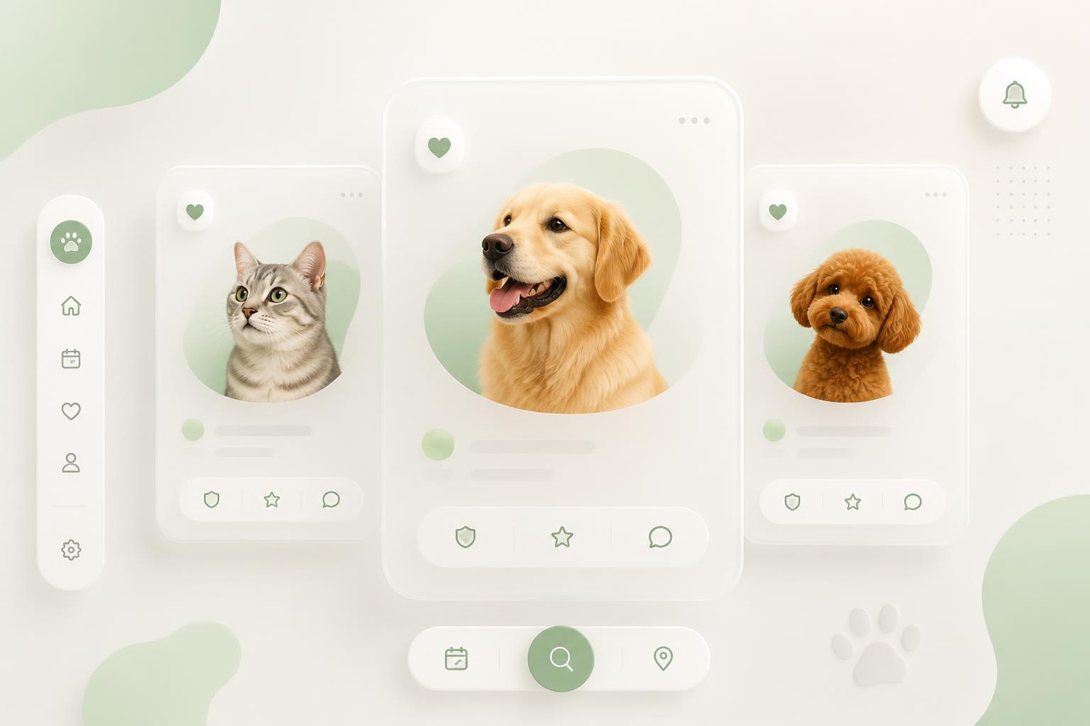
Connecting pet sitters with owners — a marketplace concept built around fast, trusted matches, taken from research and personas through information architecture and wireframes to a prototyped interface.

Project type

End-to-end UX case study

Role

UX/UI Designer

Platform

Mobile app — two-sided marketplace

Year

2021

SitMyPet — Pet Sitting App

Key outcomes

2 sides

Owners and sitters designed as one system

Trust

Profiles, reviews and verification at the core

End-to-end

Research, IA, wireframes, UI and prototype

Context

Finding someone you trust with your pet

Pet owners rely on informal networks — friends, neighbours, local groups — and fall back on expensive boarding when nobody is available. Sitters have no simple way to prove they are reliable.

The project explored a marketplace where both sides find each other quickly, and where trust is designed in rather than assumed.

Research

Both sides of the same anxiety

I interviewed owners and sitters separately and found the same underlying worry expressed from two directions: owners fear handing their animal to a stranger, sitters fear turning up to an unclear job.

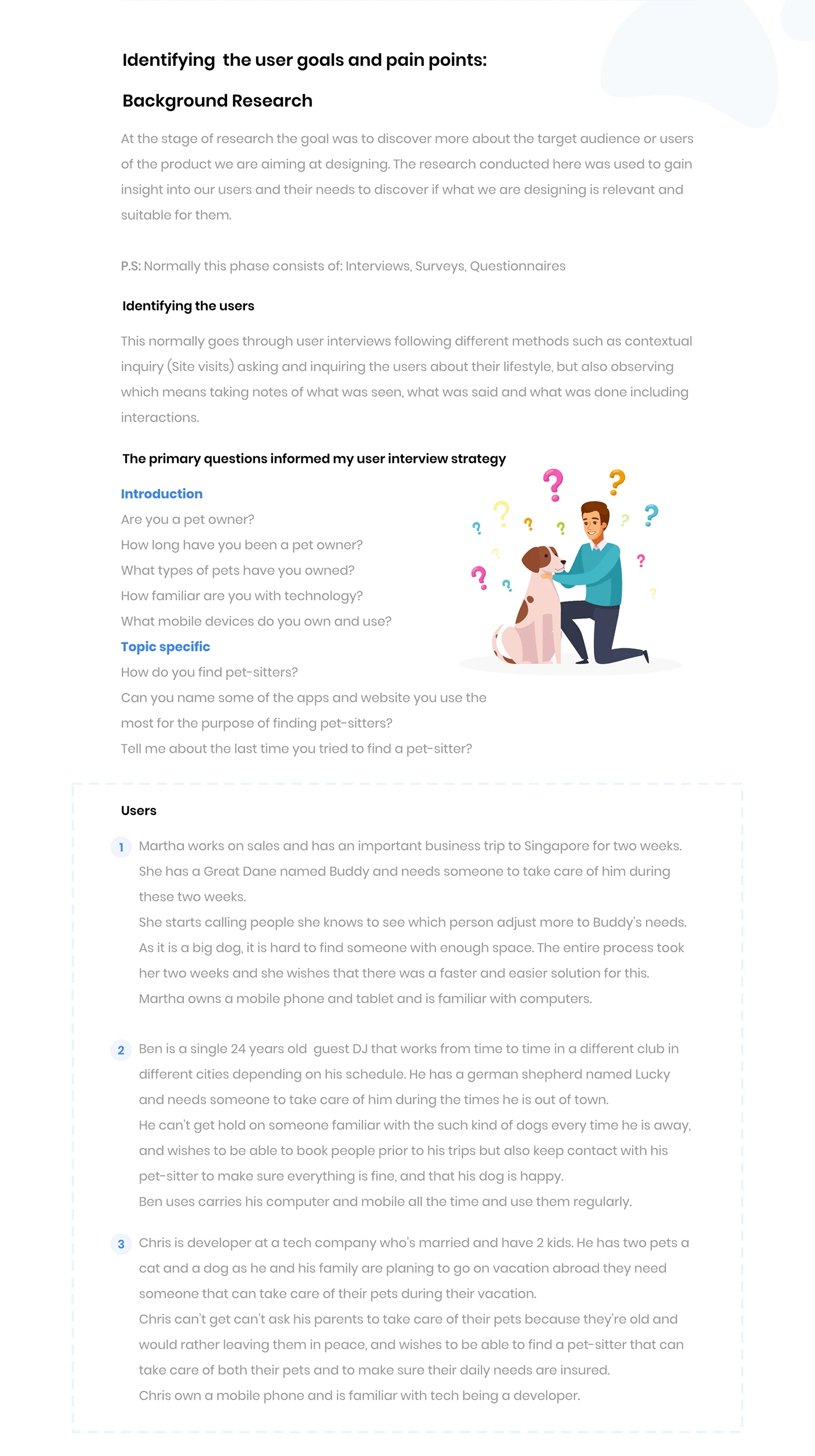
Background research, interview strategy and user descriptions
Background research
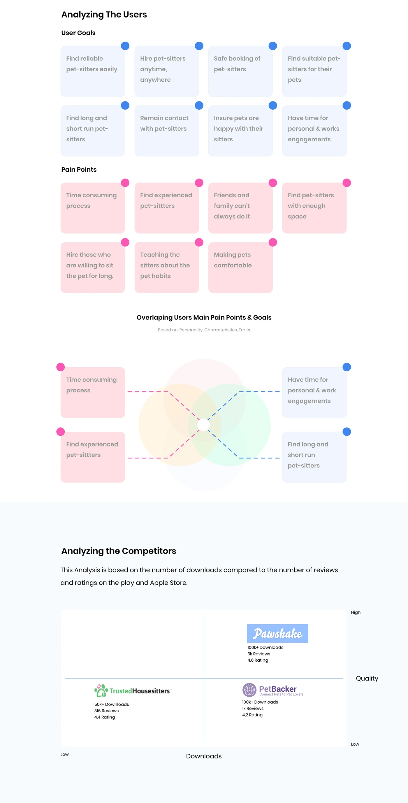
User goals and pain points mapped, plus competitor analysis
Goals, pains, competitors
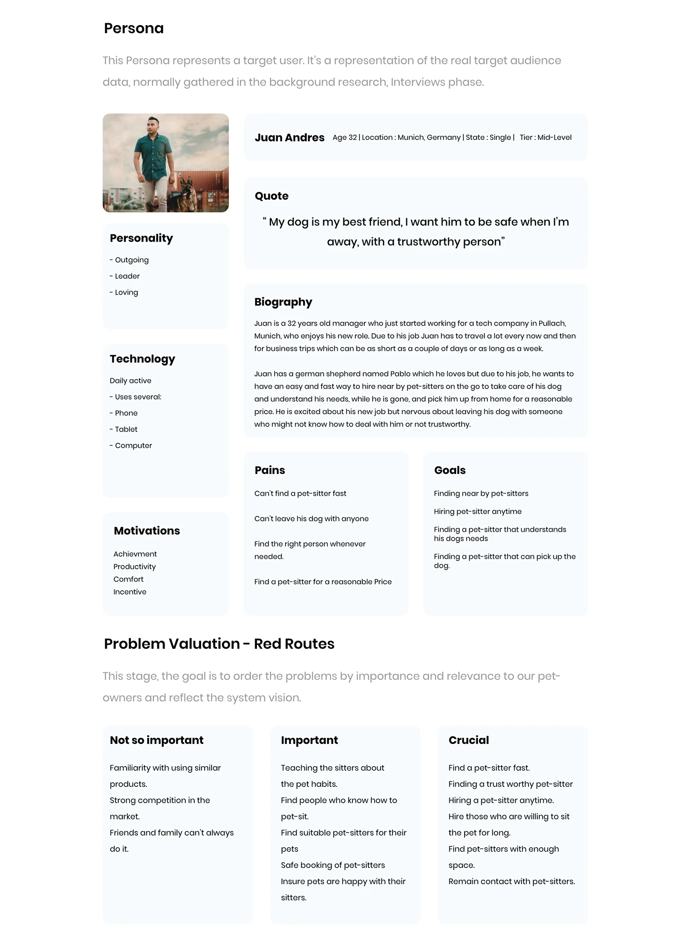
SitMyPet persona and red-route problem valuation
Persona & red routes

Research boards: goals, pain points, competitor analysis and the persona.

C

Clara, 33

Dog owner, travels for work

“I'd rather cancel a trip than leave him with someone I don't trust.”

Goals

  • Verified sitters nearby
  • See reviews and photos
  • Daily updates

Frustrations

    Last-minute cancellations
    No proof a sitter is experienced
    Expensive boarding as the only fallback
M

Mehdi, 22

Student sitter, building a reputation

“I'm good with animals — I just have no way to show it.”

Goals

  • Steady bookings
  • Clear care instructions
  • Build reviews

Frustrations

    Competing with established sitters
    Vague expectations on arrival
    Payment arranged off-platform

One persona per side of the marketplace.

Information architecture

Two entry points, one shared spine

Rather than building two apps, I structured one product with a role switch at onboarding. Search, booking and messaging are shared; only profile and availability differ.

Site map

App root

Find

  • Search by pet & date
  • Filters
  • Map view
  • Sitter profile

Book

  • Request dates
  • Care instructions
  • Price summary
  • Confirmation

Talk

  • Messages
  • Handover checklist
  • Updates & photos

Me

  • Role switch
  • Verification
  • Reviews
  • Payments

App structure shared across both roles.

Card sort — FigJam board

Proof

ID verified
Reviews
Past stays
Response rate

Fit

Pet types
Home setup
Experience
Languages

Practical

Availability
Distance
Price per night
Extras

Comfort

Photos
About me
Own pets
House rules

Card sort output — what owners expect to see on a sitter profile.

Wireframes

Structure before styling

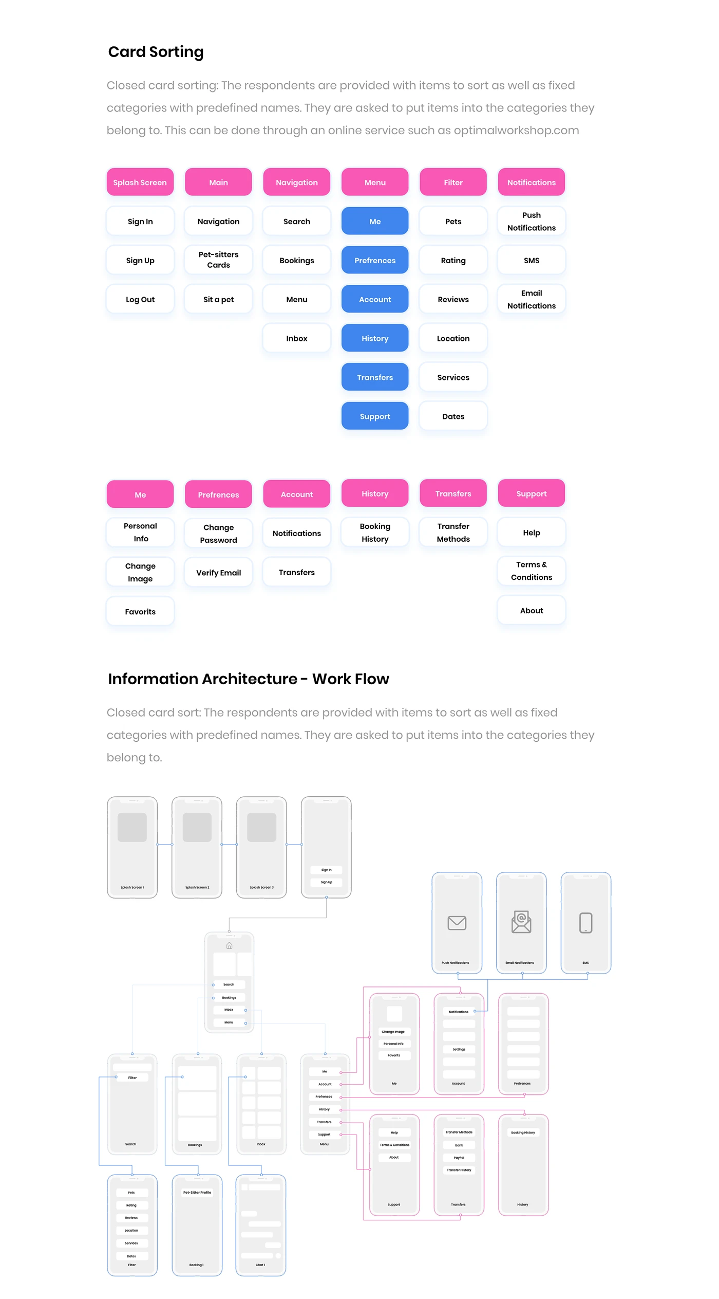
Closed card sorting results and the resulting information architecture work flow
Card sort & IA
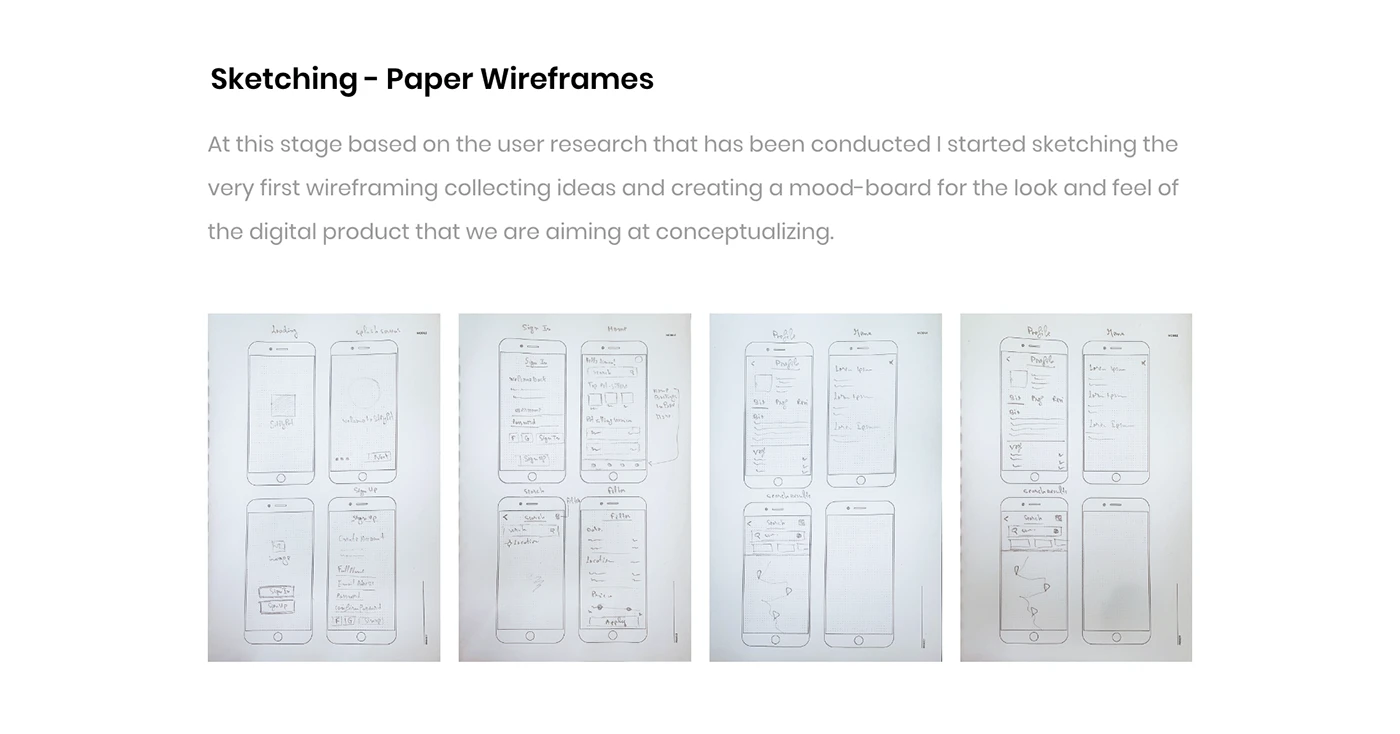
Paper wireframe sketches for the SitMyPet app
Paper sketches
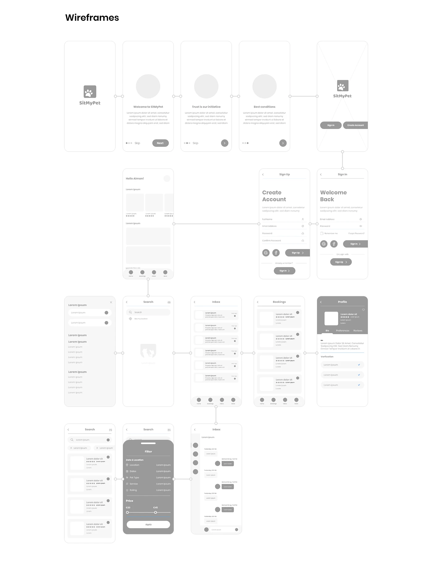
Digital wireframes of the SitMyPet owner flow
Wireframes

Card sorting, the work-flow architecture, paper sketches and wireframes.

Wireframes

Pet + dates
Map / list toggle
Filters
Sitter results
Search
Photo & verification
Reviews summary
Experience & pets
Request booking
Sitter profile
Dates
Care instructions
Price breakdown
Send request
Booking request
Booking status
Thread
Handover checklist
Messages

Core owner-side flow, sketched before any visual design.

Solution

Key design decisions

State machine

Requested

Owner sent dates; sitter has a response window.

Accepted

Confirmed with care instructions locked in.

In care

Stay running — updates and photos expected.

Completed

Closed, payment released, reviews invited.

Booking states shown identically to both sides.

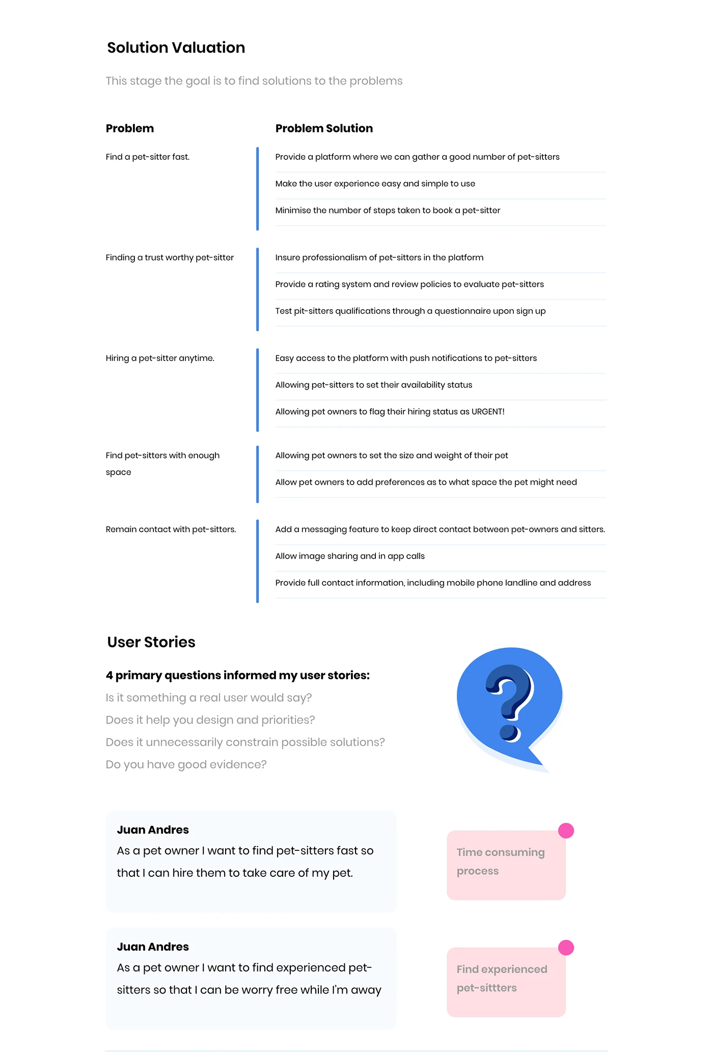
Problem-to-solution mapping and the primary user stories
Solution & user stories
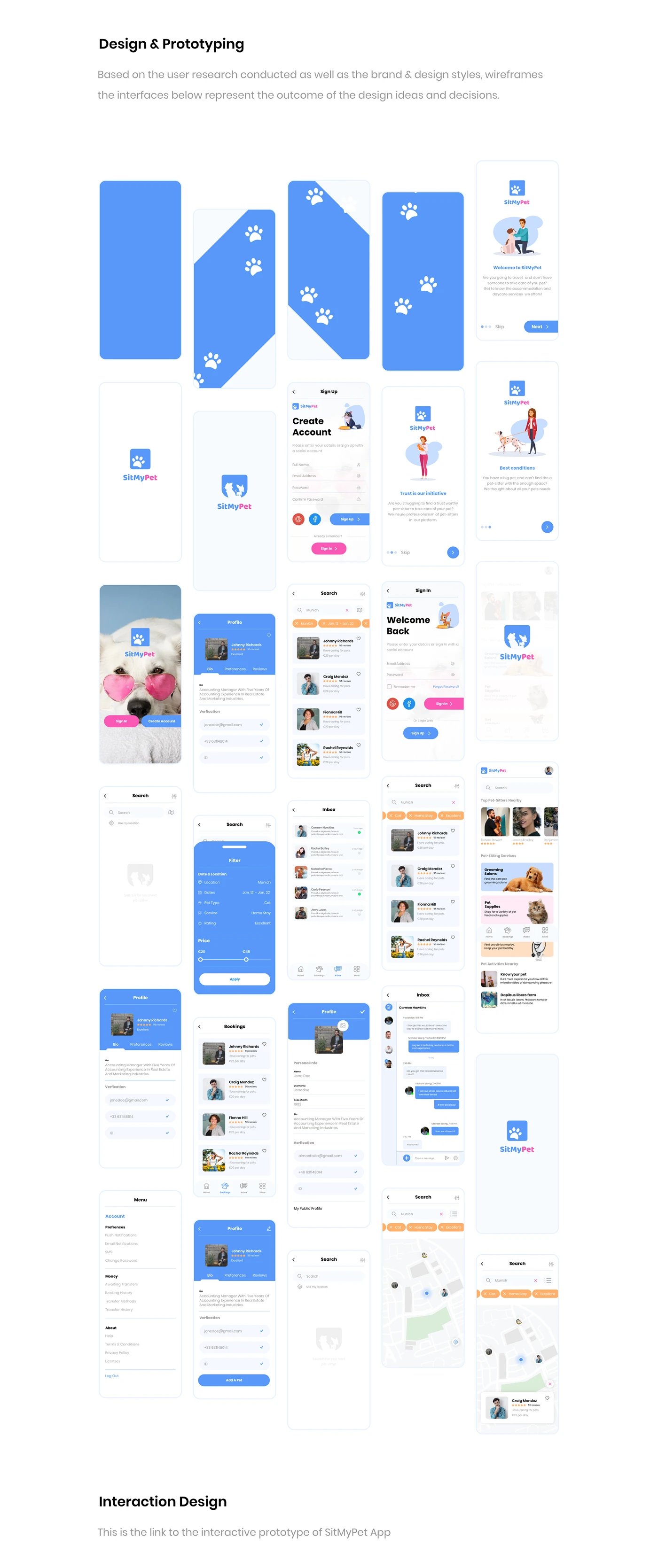
SitMyPet final mobile screens: onboarding, search, profiles and booking
Design & prototyping

Solution mapping and the final SitMyPet interface.

Reflection

What I took from it

In a two-sided marketplace, trust is the product. Every screen either builds it or spends it.

Designing both sides in parallel exposed mismatched expectations early — especially around availability and pricing.

Tools — Adobe XD, Illustrator, Photoshop

View the original Behance gallery ↗All case studies

Next project

Guest Hub

Limehome — App · 2025

Read next case study →