Limehome — App · 2025

In progress

Guest Hub

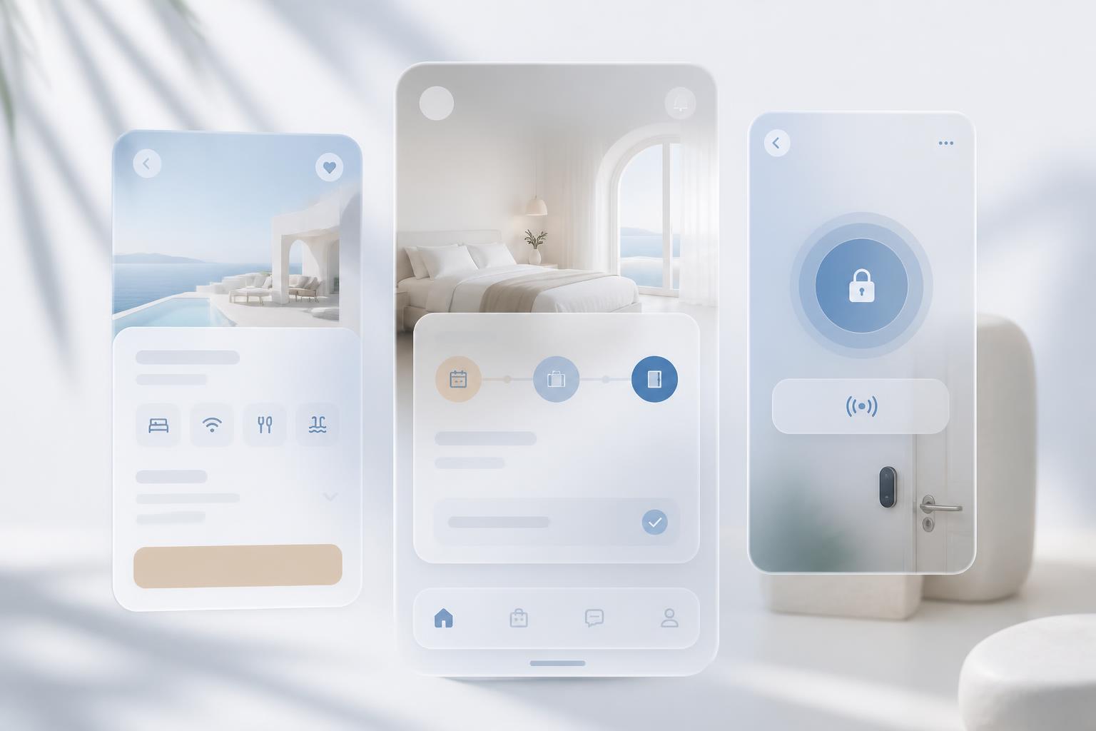
A central hub where guests organise their booking, check in, unlock their door and add services — replacing a scattered mix of emails, links and support chats with one place that always answers “what happens next?”.

Still being finished

The research, architecture and flow work is documented here in full. The final Limehome screens are still going through internal review, so the UI shots are placeholders for now.

Request the full deck

Project type

Product design & design system

Role

Lead Digital Product Designer

Platform

Mobile app (iOS & Android)

Year

2025

Limehome — App — Guest Hub

Key outcomes

1 place

Booking, check-in, access and services unified

SparkUI

Built entirely on the in-house design system

Fewer tickets

Self-service replaces repetitive guest support requests

Cross-team

Shipped with product, engineering and operations

Context

Everything a guest needed lived somewhere else

Limehome is a fully digital hospitality operator — there is no reception desk. The app is the front door: if a guest cannot find their access code or understand their check-in status, the only fallback is support.

Before Guest Hub, the essentials were spread across confirmation emails, deep links and separate flows. Guests reread emails to find codes, and operations absorbed the confusion as repetitive tickets.

Research

Who actually opens the app, and when

I combined a ticket audit with guest interviews and on-site shadowing. The two dominant profiles were not who the old flows assumed — the app was written for a leisurely browser, while most sessions were short, stressed and arrival-driven.

M

Marta, 34

Business traveller · 1–2 nights

“I land late, I just need the door code and to know the room is actually mine.”

Goals

  • Check in before landing
  • Find the access code in one tap
  • Invoice ready for expenses

Frustrations

    Digging through email threads
    Not knowing if check-in was accepted
    Support chat as the only fallback
J

Jonas, 41

Family stay · 4+ nights

“Halfway through the stay I wanted late checkout and had no idea it existed.”

Goals

  • Extend the stay without calling
  • Add cleaning and parking mid-stay
  • Share access with his partner

Frustrations

    Services buried in a separate tab
    Unclear what is included in the rate
    Repeating information to support

Two primary profiles, rebuilt from ticket clustering and guest interviews.

Opportunity

One hub, ordered by what happens next

Information architecture

Grouping the hub around the stay, not the org chart

The legacy navigation mirrored internal systems: booking engine, access system, upsell catalogue. I ran a hybrid card sort with fourteen guests over the labels they actually used, then restructured the hub into four predictable groups.

Card sort — FigJam board

My stay

Check-in status
Arrival time
Dates & guests
Extend stay

Getting in

Door code
Building entry
Wi-Fi
Directions

While I'm here

Cleaning
Parking
Late checkout
Local guide

Admin

Invoice
Payment method
Cancellation policy
Contact support

Hybrid card sort — the clusters guests formed from 28 content cards.

Site map

App root

Home (stay-aware)

  • Current phase card
  • Primary action
  • Next-step hint
  • Alerts

Access

  • Door unlock
  • Building code
  • Wi-Fi details
  • How to find us

Services

  • Contextual offers
  • Cleaning & linen
  • Parking
  • Late checkout

Booking

  • Dates & guests
  • Invoices
  • Policies
  • Support handover

Resulting information architecture for the hub.

Process

From guest journey to a system

User flow

  1. 01BookedConfirms dates, waits for arrival information.
    Pain pointDetails only exist in email
  2. 02Pre-arrivalCompletes ID and payment verification.
    Pain pointNo confirmation that check-in succeeded
  3. 03ArrivalFinds the building and unlocks the door.
    Pain pointCode hunted for under time pressure
  4. 04In-houseRequests cleaning, parking, late checkout.
    Pain pointServices invisible mid-stay
  5. 05CheckoutLeaves, needs invoice and receipt.
    Pain pointInvoice requested through support

Stay journey with the friction points the hub had to absorb.

Wireframes

Stay status
Phase card
Complete check-in
Booking summary
Upcoming stay
Stay status
Arrival details
Show door code
Directions
Check-in ready
Stay status
Unlock door
Suggested services
Stay details
In-house
Stay status
Thank you / rating
Download invoice
Book again
Checked out

Low-fidelity structure for each phase of the hub.

Solution

Key changes introduced

State machine

Upcoming

Booked, check-in not yet open. Action: prepare.

Check-in ready

Verification open. Action: complete check-in.

In-house

Access granted. Action: unlock and add services.

Checked out

Stay closed. Action: invoice and rebook.

The state model the home screen renders against.

Coming soonFinal UI shot placeholder
Hub — upcoming
Coming soonFinal UI shot placeholder
Hub — check-in
Coming soonFinal UI shot placeholder
Access
Coming soonFinal UI shot placeholder
Services

Final Limehome UI is pending internal review — placeholders for now.

Impact

What changed

Reflection

What I took from it

In hospitality, clarity is service. Most guest frustration was not missing features — it was not knowing the state of their own stay.

Designing the hub as phases rather than pages kept the interface small while the product kept growing.

Tools — Figma, FigJam, Jira, Confluence, Hotjar, Maze

View the original Figma deck ↗All case studies

Next project

Multi-Room Booking Experience

Limehome GmbH · 2024

Read next case study →