Playlist Map · 2021–2022
Music Curating Platform
A unified visual identity and new homepage that clearly communicates the platform's core value, with a reusable UI component system that made future features faster to build.
Project type
Case study
Role
Product Designer
Platform
Web app
Year
2021–2022

Key outcomes
+42%
Trial engagement after clarifying core value
+63%
Faster access to features like curator matching
−40%
Dev time using modular components
4.6★
Smoother flow and greater trust in testing
Context
What is PlaylistMap?
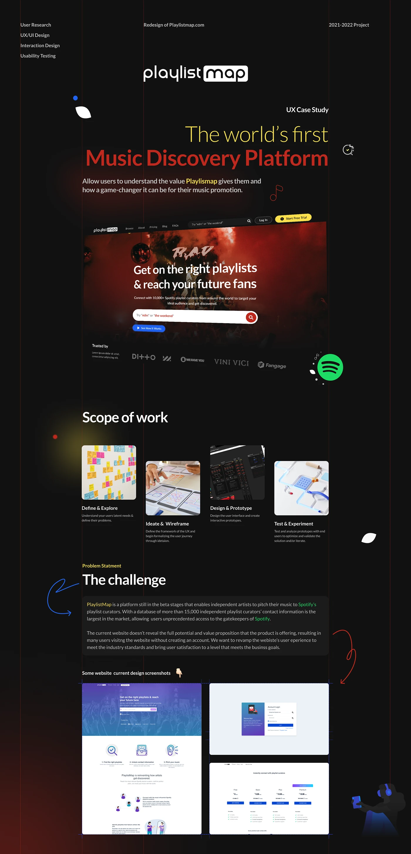
The original site didn't clearly explain what PlaylistMap did or why it mattered. Artists often left without understanding how the platform worked or how it could help them.
The goal was to redesign the product experience to better communicate value, reduce cognitive load, and encourage signups without friction.


Opportunity
From a backend-driven product to a user-first experience
- 01Help users quickly understand the platform's value.
- 02Reduce friction when browsing or trying the product.
- 03Build UX patterns that encourage account creation and engagement.
- 04How might we help independent artists discover, trust and use PlaylistMap without deep technical knowledge?
Research
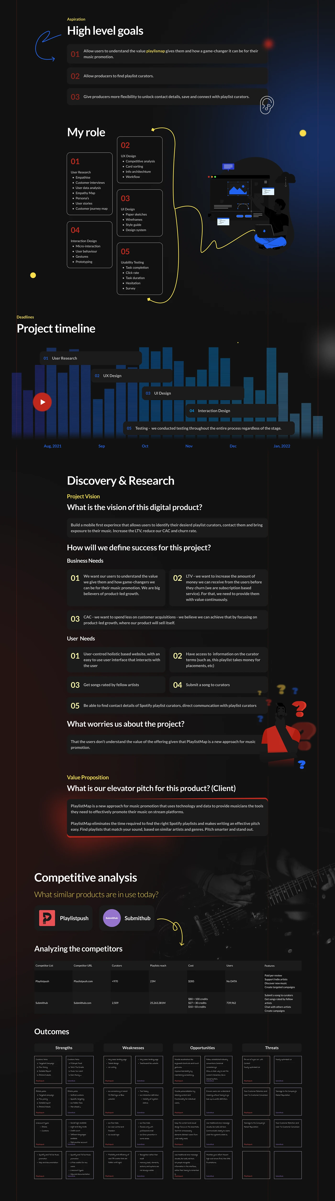
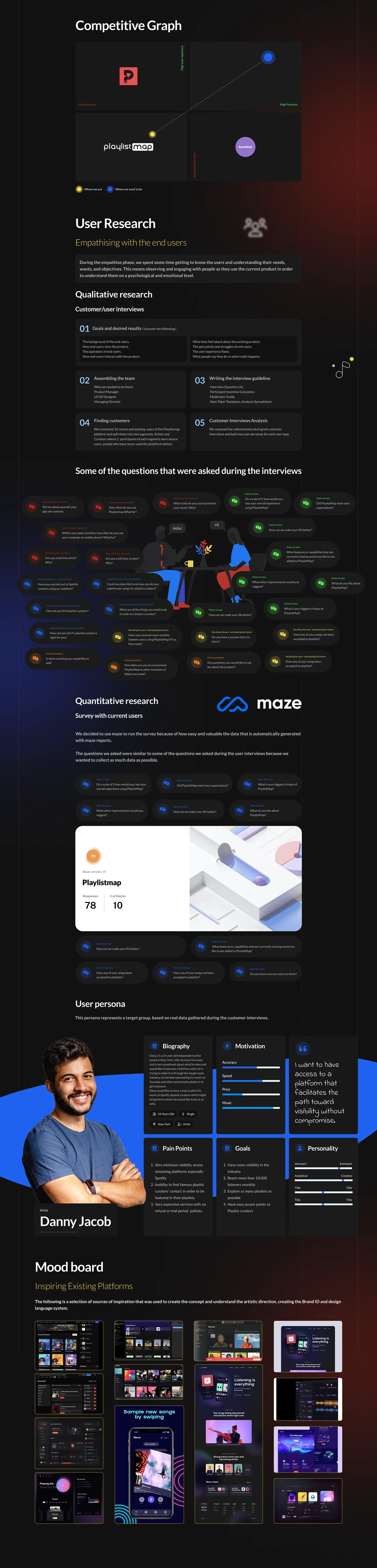
Qualitative interviews, Maze surveys and competitive analysis
- 01Artists wanted faster access to curators without commitment.
- 02Many didn't understand what PlaylistMap offered.
- 03The UI lacked clarity, especially around pricing and value.


User journey
Mapping high-friction areas
- 01Unclear homepage messaging.
- 02Unused free trial prompts.
- 03Confusing curator access experience.

Solution
Key changes introduced
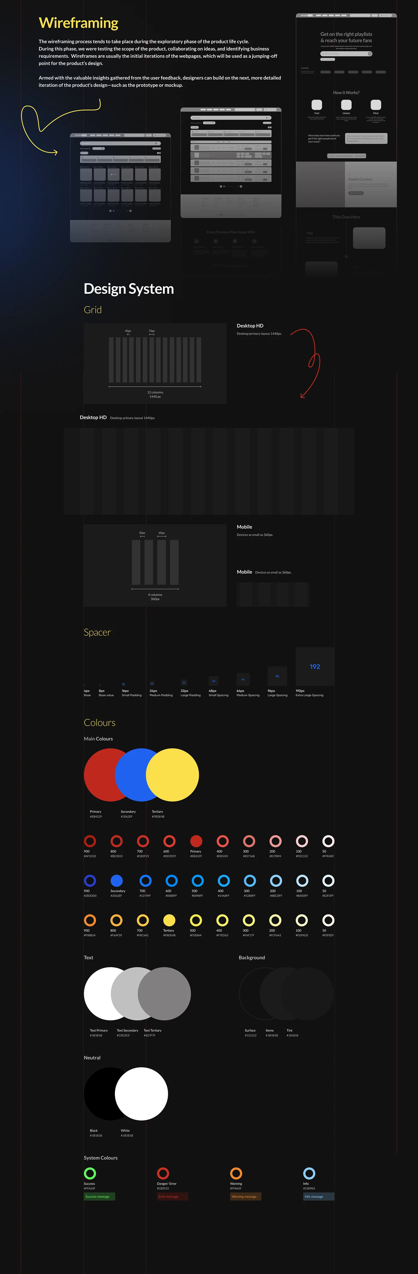
- 01A new homepage that clearly communicated what PlaylistMap is and how it works.
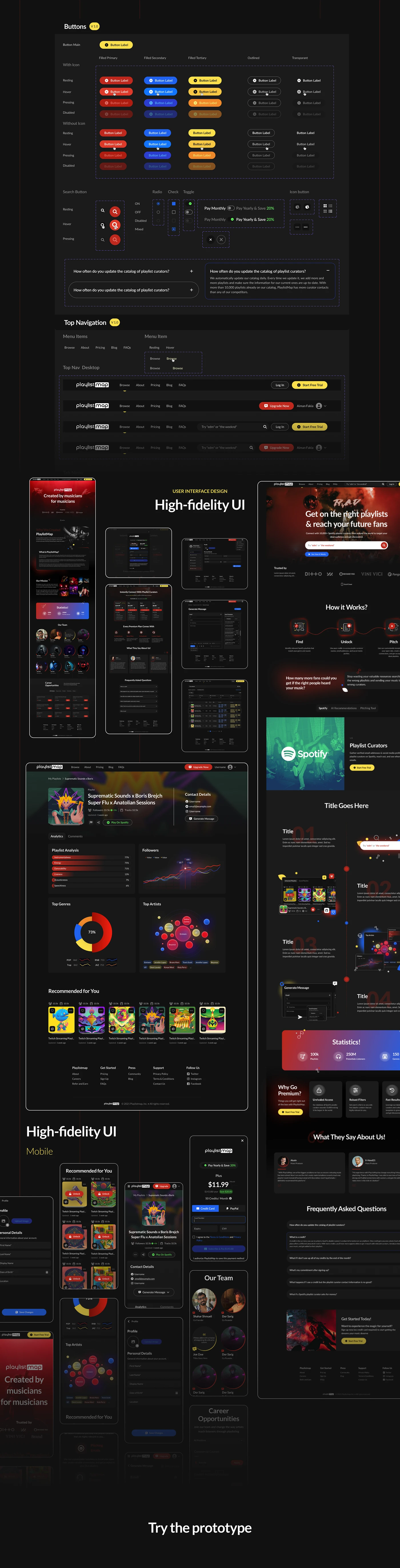
- 02Visual storytelling and value-focused UI components.
- 03Curator discovery UI with search filters and trust-building design.
- 04A responsive system with scalable UI tokens and dark mode.


Impact
Post-design validation
- 01Trial-to-signup conversion +37%.
- 02CTA interaction rate +54%.
- 03Bounce rate reduction −31%.
- 04Average session duration +28%.
- 05Design language reused across upcoming features for consistency.
Reflection
What I took from it
This project reminded me how much design is about clarity. Most users weren't struggling with functionality — they were just confused.
The power of UX here was explaining value fast, reducing noise, and guiding users without effort.
With more time: usability tests on mobile-first scenarios, and more community-driven features for repeat engagement.
Tools — Figma, FigJam, Maze, Optimal Workshop, Jira
View the detailed Behance case study ↗Next project
Pet Sitting App
SitMyPet · 2021 →