AnswerBite · 2023–2024
AI Content Platform
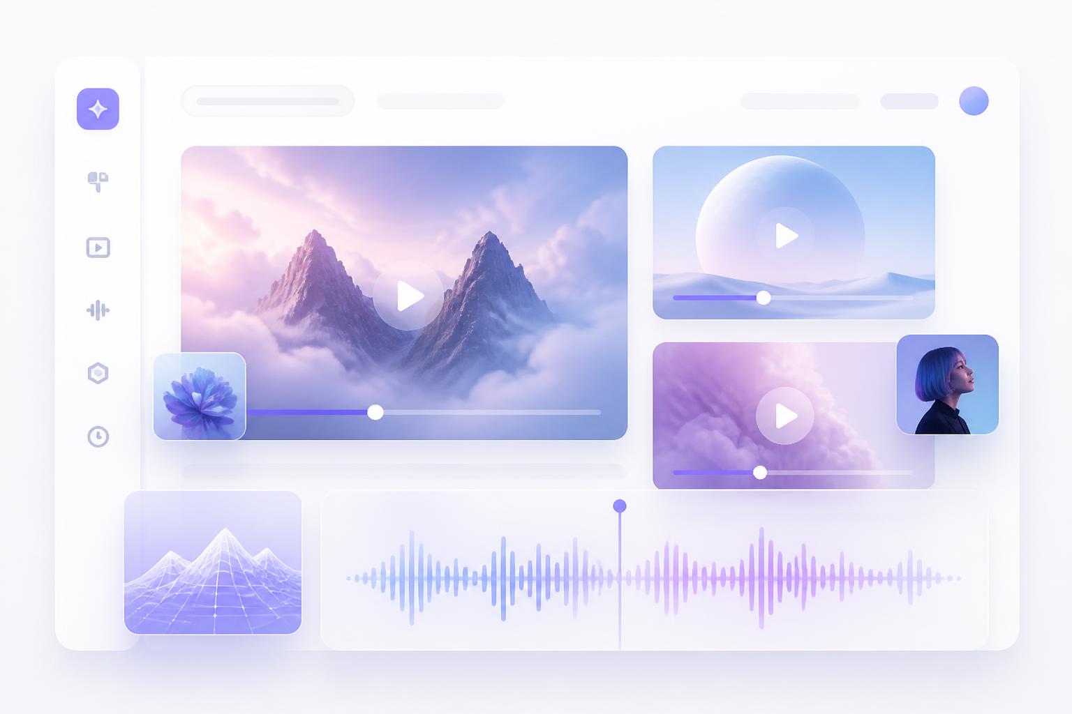
Redesigned the MVP web app to make video upload, processing, and sharing clear and scalable. Focused on reducing first-time friction, clarifying system states, and making navigation more intuitive.
Project type
Case study
Role
Product Designer
Platform
Landing page & web app
Year
2023–2024

Key outcomes
+38%
Successful first uploads
−27%
Drop in abandoned sessions
4.4★
Early onboarding satisfaction
Clearer states
Fewer support tickets
Context
The MVP never told users where they stood
The MVP lacked clear guidance for first-time users. Uploading felt heavy, banners repeated messages without helping, and system states weren't explicit.
Users often didn't know whether their files were processing, ready, or failed. Navigation mixed content inputs (uploads) with outputs (deliverables), making it hard to find results.


Opportunity
Explain value better, reduce friction, boost account creation
- 01How might we make uploading and processing effortless and transparent?
- 02How might we organise navigation so users find content and outputs faster?
- 03How might we use copy and states to guide users with confidence?
Team & scope
Team & scope
- 01Designed solo with the founder and one engineer.
- 02Scope: MVP redesign across upload, Library, Deliverables, Clips, AI Rewrite and Account.
- 03Timeline: 8 weeks to ship v1, iterative rollout afterward.
- 04Constraints: limited dev bandwidth, no existing design system, tight deadlines.
Research
What we learned
- 01Users wanted clear progress feedback during upload.
- 02Confusion came from duplicate banners and redundant steps.
- 03Navigation (Library, Deliverables, Clips, Social) felt disorganised.
- 04First-time users expected a single source of truth for content states.


User journey
Landing → upload → processing → review → deliverables → sharing
Friction points: unclear status during processing, lack of guidance in empty states, and confusion in finding outputs.

Solution
Key changes introduced
- 01Streamlined upload flow — fewer steps, with clear progress.
- 02Simplified navigation — inputs (uploads) and outputs (deliverables) grouped logically.
- 03State feedback simplified — Processing / Ready / Error, always explicit.
- 04One banner system — concise, action-driven copy.
- 05Guided empty states — helpful first-time cues for uploading.
- 06AI Rewrite redesigned as a side-by-side before/after for clarity.


Impact
What changed
- 01+38% successful first uploads during testing.
- 02−27% abandoned sessions.
- 03Support tickets dropped as states became self-explanatory.
- 04Early testers rated onboarding 4.4★.
Reflection
What I took from it
State clarity is often more valuable than adding features.
Microcopy drives trust as much as interface changes.
Building a simple structure early prevents rework as products scale.
Tools — Figma, FigJam, Maze, Jira, Hotjar
View the original case study ↗Next project
Music Curating Platform
Playlist Map · 2021–2022 →